How Corporate Logo Cupcakes Are Printed and What Artwork Files Help
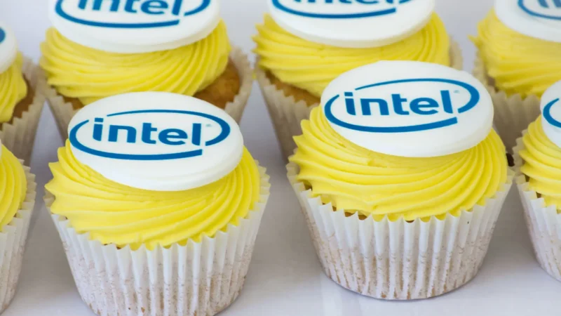
Corporate events in Australia often lean on small details to look polished, and branded desserts are one of the easiest wins. Corporate logo cupcakes work because they are both functional catering and a clear visual cue of brand presence. This guide explains how corporate logo cupcakes are printed, what can and cannot be printed, and which artwork files help bakeries deliver crisp, accurate results. How are corporate logo cupcakes printed in Australia? Most Australian cupcake studios print logos by producing a flat, edible “topper” that sits on icing, rather than printing directly onto buttercream. In practice, corporate logo cupcakes are usually finished with either edible image sheets or edible ink printing onto sugar-based toppers. The two most common methods are edible ink printing onto icing sheets and printed fondant discs. Both start with a digital file, then a food-safe printer creates the edible image at the requested size. What printing methods are most common for corporate logo cupcakes? Edible ink on icing sheets is the most common because it is fast, consistent, and cost-effective for medium to large runs. Many suppliers use a food-safe inkjet printer loaded with edible inks to produce multiple logos per sheet, then cut circles to fit standard cupcake sizes. Fondant printing is also used when they want a more matte, premium finish. Some kitchens print onto fondant discs, while others apply an icing-sheet print on top of fondant for structure.” What is an icing sheet and how does it affect print quality? An icing sheet is a thin, edible film made from sugar and starches designed to accept edible ink. It generally produces sharp edges and good colour blocks, which is why corporate logo cupcakes often use it for clean brand marks. Print quality depends on storage and moisture. If the topper absorbs humidity, colours can soften and fine lines can bleed, especially in coastal Australian cities like Sydney, Newcastle, and Brisbane. How do edible inks work, and do colours match brand guidelines? Edible inks are food-grade dyes formulated for printers, and they behave differently to standard CMYK inks. They can look slightly muted once dry, and colours may shift depending on the topper material and lighting at the venue. For corporate logo cupcakes, bakeries usually aim for “close match” rather than exact Pantone accuracy. If strict brand colour is required for an Australian national campaign, the safest approach is to provide a reference image and approve a printed sample run. How are logo toppers cut and sized for consistent results? After printing, the edible sheet is cut into discs using handheld cutters, circle punches, or automated cutters for larger volumes. Standard discs often range from 45 mm to 60 mm, depending on cupcake size and the amount of icing. Smaller discs can make text unreadable. For corporate logo cupcakes, most studios recommend simplifying the mark or increasing disc size if the logo includes taglines, ABNs, or thin typography. How are corporate logo cupcakes assembled without smudging the print? They are usually assembled by placing the topper onto a dry surface like fondant, modelling chocolate, or a crusted buttercream layer. If the icing is too wet, it can dissolve the topper edges or cause colour bleed. Many Australian bakeries chill cupcakes briefly to firm the icing, then apply toppers closer to dispatch time. This reduces condensation risk, which is a common cause of blurred corporate logo cupcakes after refrigeration. Why do some prints crack, blur, or warp during transport? Cracking often comes from toppers drying out or being bent during packing. Blurring and warping typically come from moisture, condensation, or high humidity, particularly during summer deliveries in Perth, Darwin, or North Queensland. Transport also matters. If boxes shift in a vehicle or sit in direct sun, icing can soften and toppers can slide. For corporate logo cupcakes, secure cupcake inserts and a temperature-controlled delivery window are as important as the print itself. What artwork files help bakers print clean corporate logo cupcakes? Vector files are the gold standard because they scale without losing sharpness. For corporate logo cupcakes, AI, EPS, or print-ready PDF files usually produce the crispest edges, especially for logos with fine lines or small text. High-resolution PNGs can also work if they are truly large enough. As a rule, they should supply a transparent-background PNG at high resolution, not a small web graphic pulled from a website header or email signature. Should they send a PNG, JPG, PDF, AI, or EPS file? AI or EPS is best for clean logos, followed by a vector PDF exported correctly. PNG is acceptable if it is high resolution and the edges are not anti-aliased in a way that makes the mark look fuzzy when printed. JPG is usually the least ideal because it can introduce compression artefacts and unwanted backgrounds. If the order is for corporate logo cupcakes at scale, supplying a vector file reduces back-and-forth and helps the bakery maintain consistent output. What resolution and dimensions are ideal for edible printing? If they are providing raster artwork, 300 dpi at final print size is the usual target. For a 60 mm topper, they should provide artwork that is at least 700 pixels wide, and more if the design includes text. Bakeries often lay out many logos on one sheet, so clean margins help. With corporate logo cupcakes, extra whitespace around the logo can also prevent cutting into critical elements like border rings or icon edges. How should they handle transparent backgrounds and white ink limitations? Most edible printers do not print white ink. That means white elements in a logo will either be the natural colour of the topper or disappear if the background is white already. For transparent backgrounds, PNGs are useful because they avoid unwanted white boxes. For corporate logo cupcakes, if the logo includes white text, the best approach is to print on a white topper and ensure the icing underneath is also light and consistent. What design changes improve legibility on small cupcake toppers? Simplifying is usually the biggest